Bar Chart
June 14, 2020
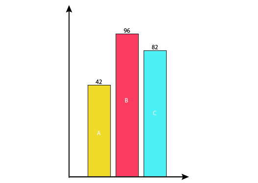
A bar chart represents the attributes of categorical variables proportionally to the height of the rectangular bars aligned horizontally or vertically along the x-axis. The color of the bars represents sub-categories or another grouping feature. It is also possible to show stacked groups with separate coloring on the same graph. Stacked bars help the reader to see the distribution among different groups easier.